7 Tips for Effective B2B Web Design

If you run a B2B business, it does not mean that you do not need to pay attention to the quality of your website. A robust website is even more critical in this line of business. So, let’s go over seven tips for effective B2B web design.
Focus on your goal and target audience
How you design your website depends on your target audience and what your business focuses on. For instance, if you are making a site for a single country or state, you can get away with making it in a single language. On the other hand, the benefits of a multilingual website for your business are many if you plan to work internationally or in areas with several different native languages. You would also approach the design of a website that offers goods differently when compared to one that provides services. However, some mainstays remain unaffected by this, and we will get to them in the rest of our tips.

Remember that some pages, such as landing pages, require particular focus.
Work on underlying site quality
While many people tend to forget about it, there is more to effective B2B web design than looks. Your site also needs to run smoothly! First, your site needs to be perfectly compatible with various devices. Whether you open it through a tablet, PC, or mobile phone, it must present the user with a quality browsing experience. Second, your pages need to load quickly and consistently. If some pages are constantly breaking and showing an error message, or if they need fifteen minutes to load, no one will want to use your site. Finally, the experts from WP Full Care also like to remind people that they need to think about the safety of their site every step of the way. Your web design cannot rely on themes or plugins that could jeopardize your or your user’s data security.

The quality of your site’s coding is essential for how it runs, so hire professionals!
Make your site appealing
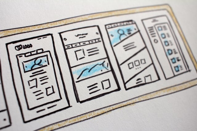
Naturally, your site needs to be appealing to the user. It is a rather silly thing to worry about, but if a potential client visits your website and doesn’t like what they see, you may lose their patronage. Just think about it: when you are in the shop and two brands have comparable prices, would you pick the one with the attractive, fancy packaging or the bland, unappealing one? The same logic applies here. Besides worrying about the site’s colors and your brand, you also need to consider its organization and utility. People nowadays hate complicated, crammed sites. A more minimalistic approach to web design is the general trend, instead of just bombarding people with information and options. This makes your website seem more serious, organized, ‘clean,’ and professional.

A simple site with good use of pictures and video looks terrific.
Use whitespace smartly
This minimalistic approach to effective B2B web design has one significant advantage: lots of ‘whitespace’ for you to play with. ‘Whitespace’ refers to the space on your page that is left empty. Now, word of warning here, you should not just go ahead and fill it up with ads and other similar gimmicks. Your website should have the whitespace, but this doesn’t mean you should leave it untouched either! Instead, what you need to do is use it to your advantage. You can use images and other media to show your services and products. You can embed access to your social media accounts. Or even embed useful software, like cost calculators or similar, if they fit the page. Also, remember that such things are not set in stone. You can change things up, and how often you should redesign your website is down to you!
Make it easy to navigate your website
Professional web design services can tell you that an essential part of effective B2B web design is making your site easy to navigate. People like it when they find what they need quickly. If your site’s a mess of disorganized links and buttons, then any serious client will likely feel compelled to leave and look for someone else. The best approach is to offer menus and submenus. For example, you can have buttons for ‘products,’ ‘services,’ ‘blog,’ and similar. From there, once someone clicks on ‘services,’ you can offer them the selection of the states you cover, and only once they select one do you present them with all the cities and towns you pander to in that particular state. If you hit them with the list of towns and cities where you operate, the list can be a bit overwhelming and hard to navigate.
Offer your website users easy access to customer support
When working B2B, deals are rarely made without consideration and negotiations. So, it is crucial to offer your website users access to someone who can answer some of their questions and further encourage them to work with you. Offering a pop-up customer service window, which allows the site user to chat with live customer support, is a fantastic way to do this. It should appear only once a user has spent some time on your site because that indicates interest. You can also program a bot with some basic answers to frequently asked questions and allow the user to connect to one of your employees if they need more.
Appeal to customers through interesting content
Finally, if you want to maximize the time your site’s visitors stay on it to increase your conversion rates, you can add interesting content to your site. The best example of this is running a blog. If it contains topics relevant to your target audience, then they will likely at least browse through it. Then, you can use the blog posts to promote your services one more time subtly.
Final comment
Being familiar with our seven tips for effective B2B web design, you can choose which of them you want to pursue. Of course, for best results, we recommend trying to incorporate all of them into your site, at least to some extent.
